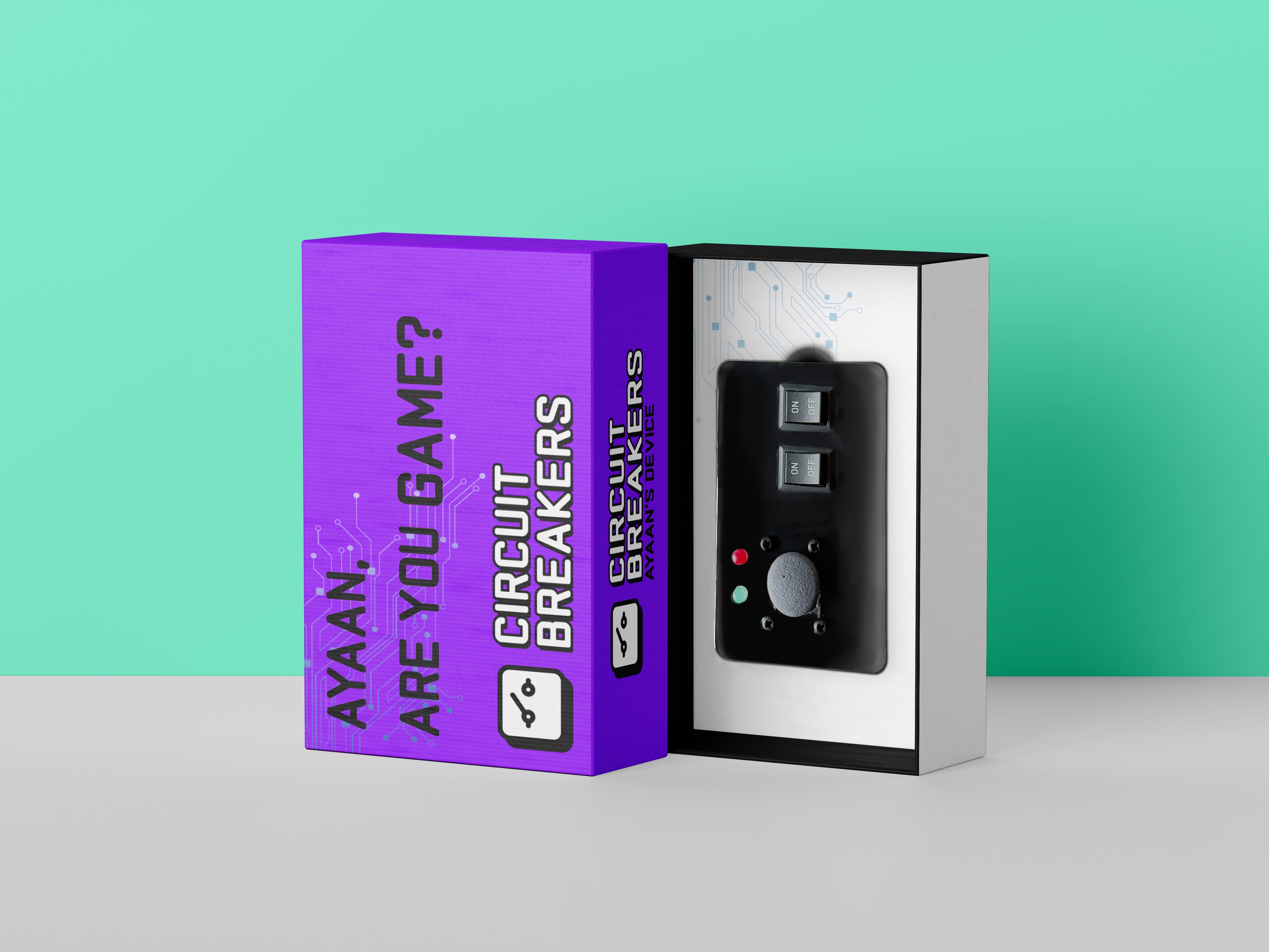
Quick Branding
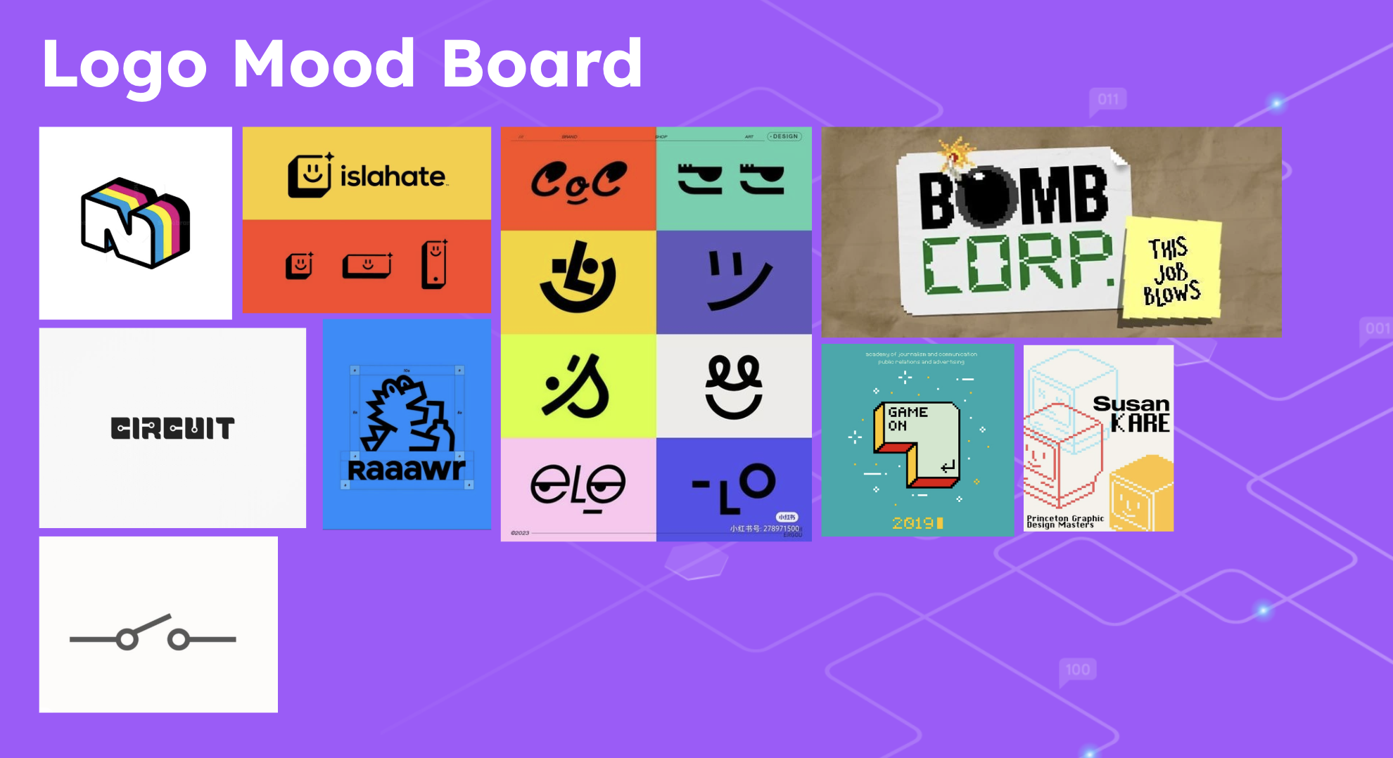
Branding wise, I wanted it to be electric, fun but also scream "circuit'. We created a mood board to start.
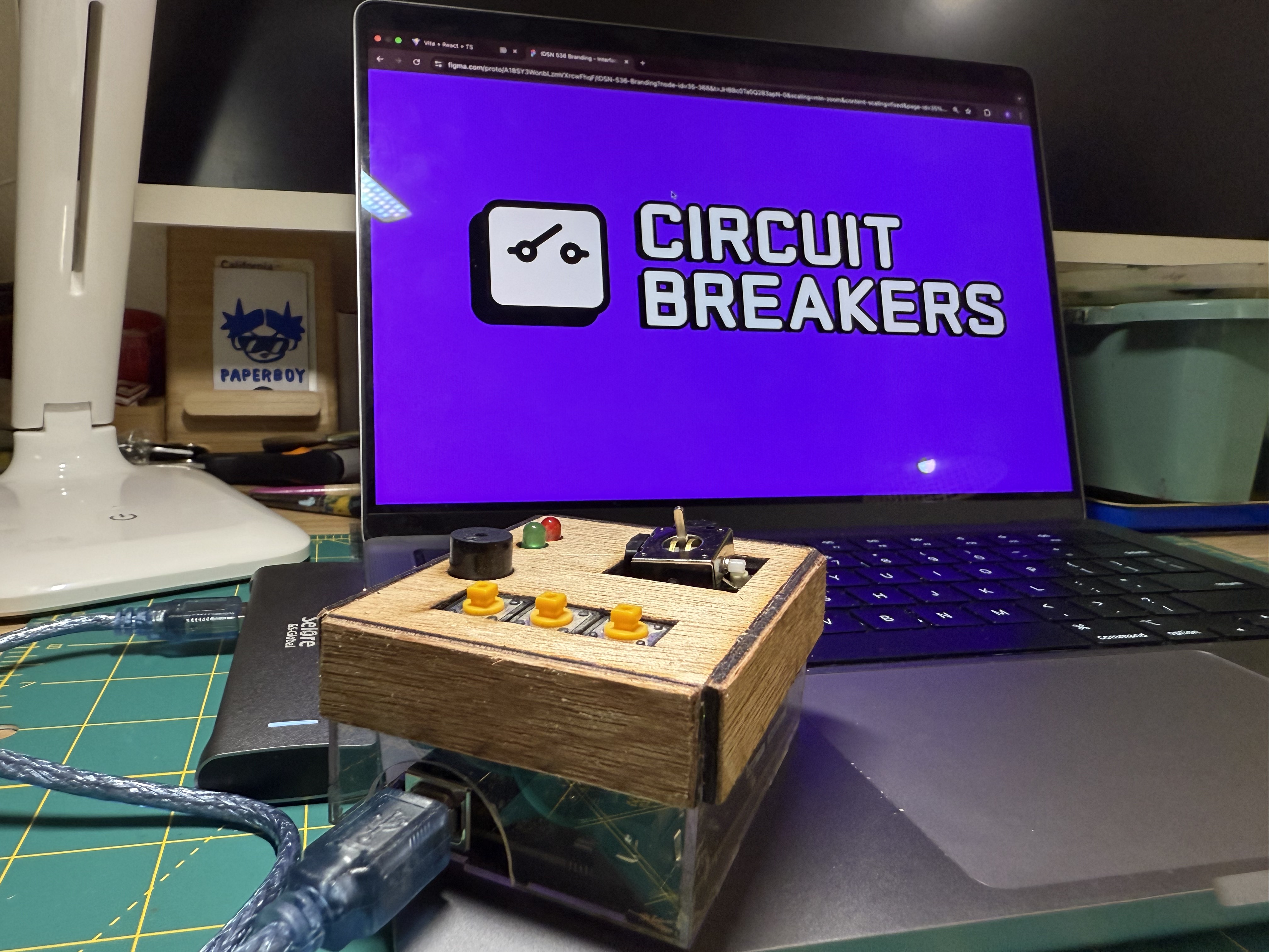
With the logo, incorporated a broken circuit but made it into a face. In a sense, the ends of the circuits look like eye lashes and the slanted circuit looked like bangs for the face.
I thought that this gave the brand character and a mascot that was incorporated into the UI .
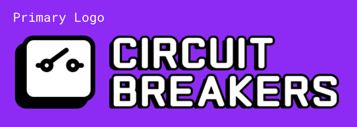
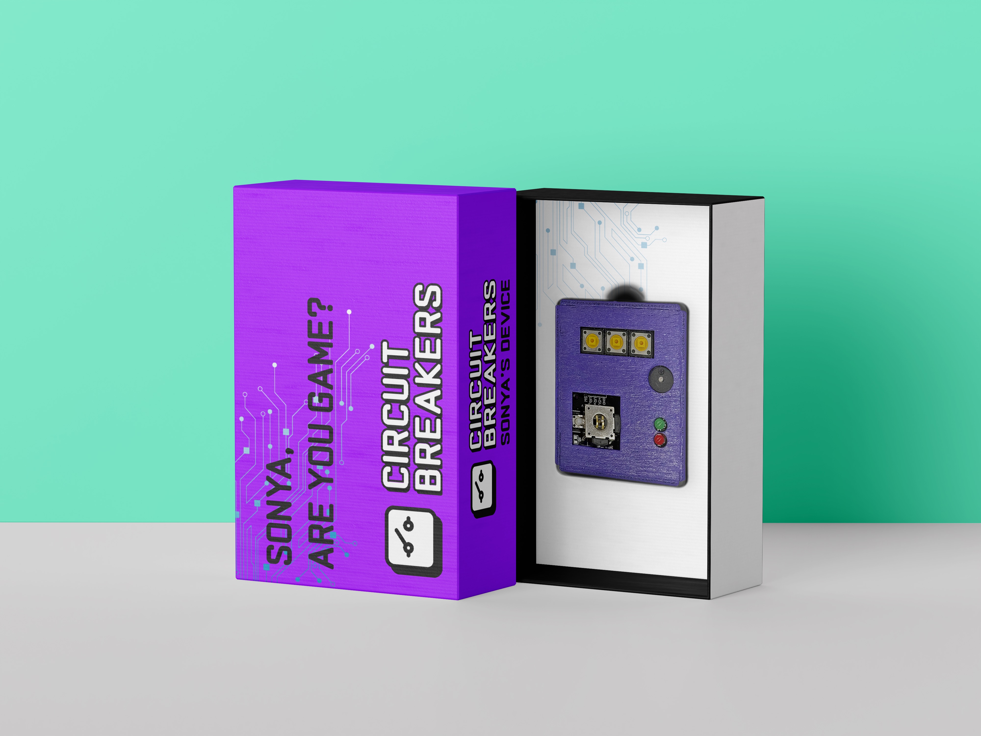
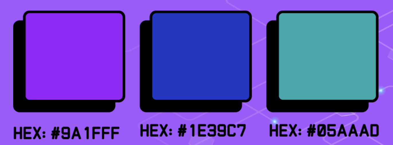
The colors for the brand were picked to be colorful, techy but also not too bright. I wanted us to be able to apply this to other areas such as possibly packaging, powerpoints and more.
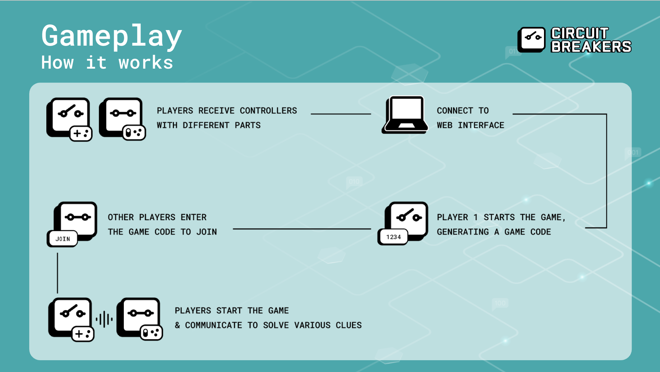
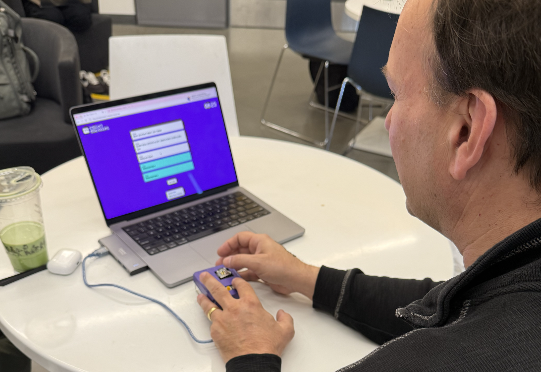
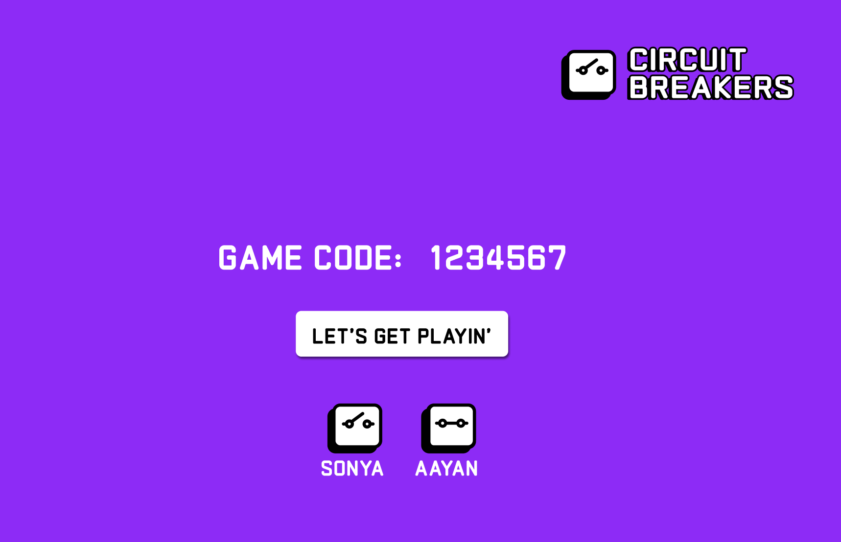
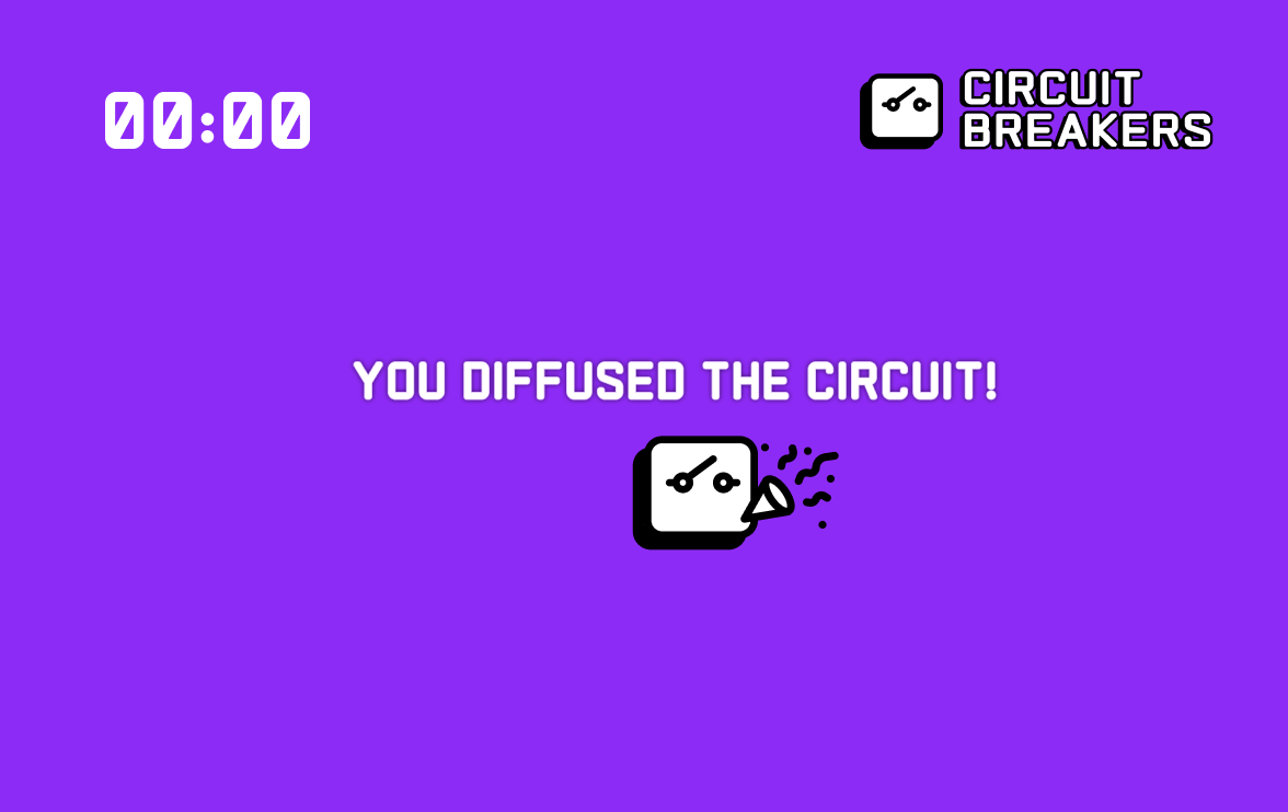
The UI
I used the logo as a character for different people that joined the game. You also experience the character logo celebrating when you win the game.
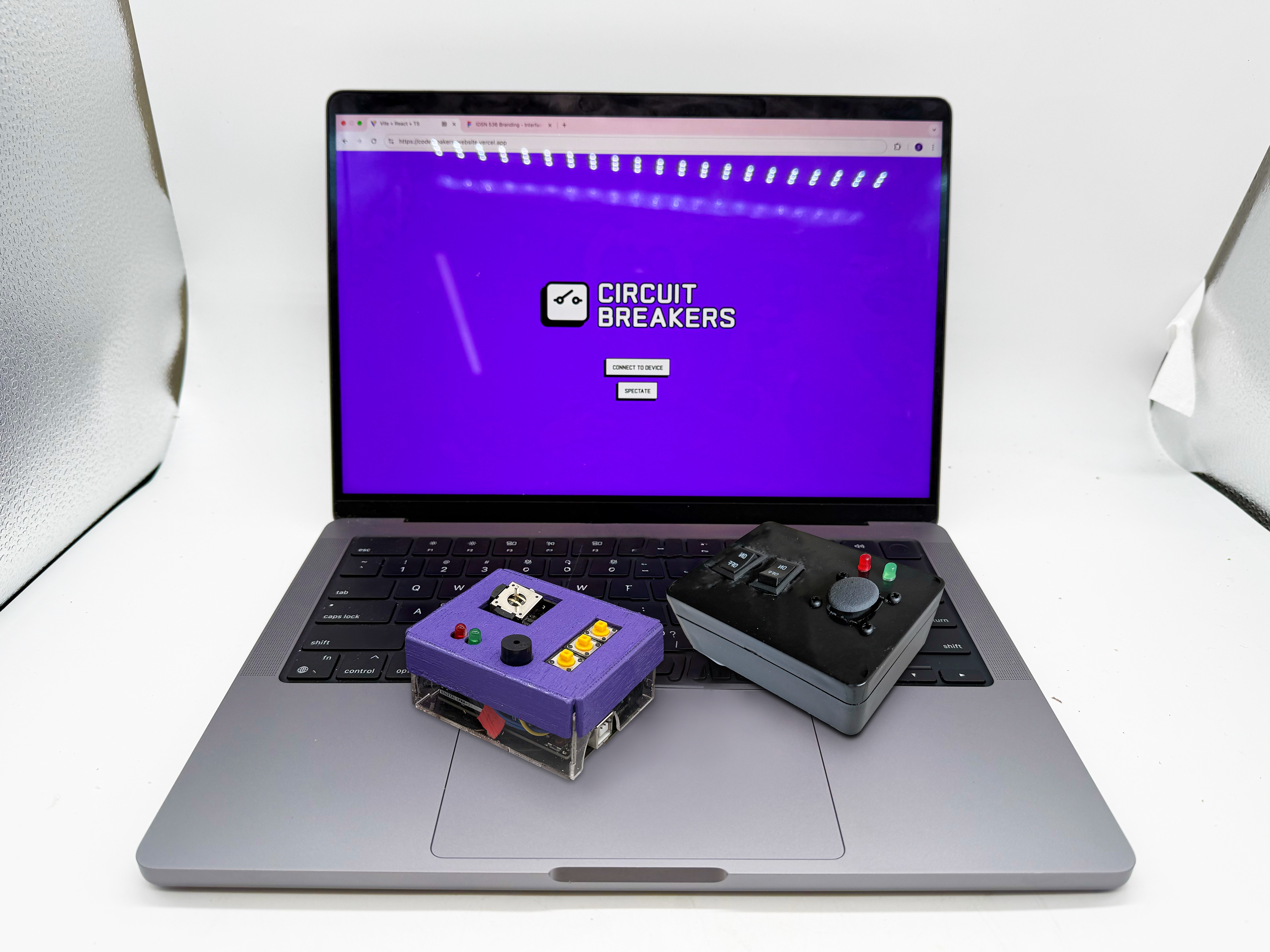
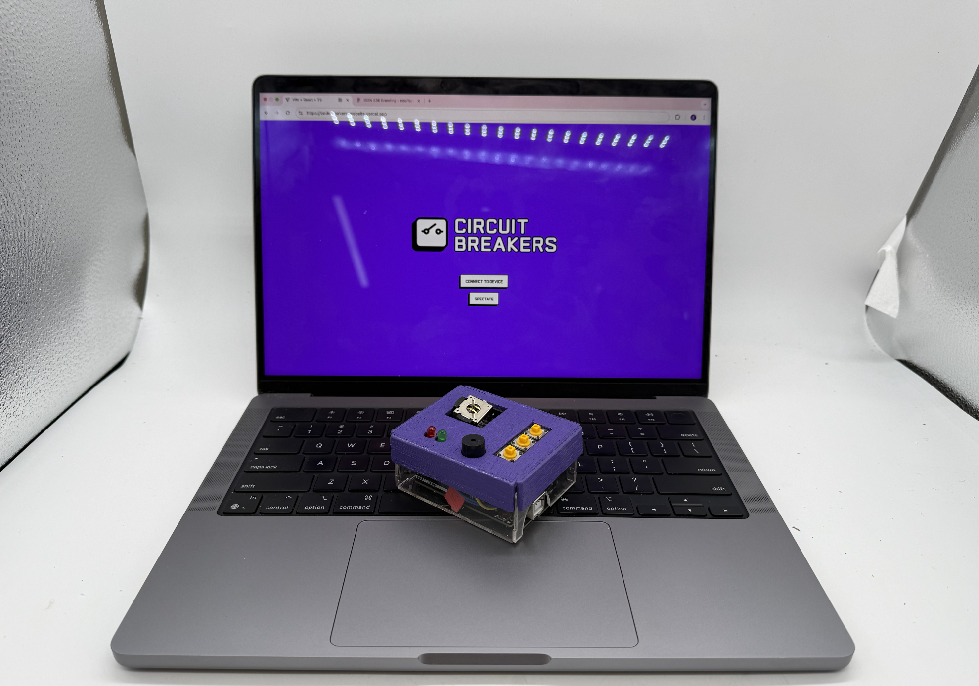
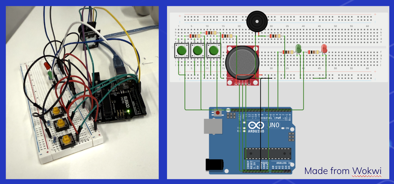
The Building Process
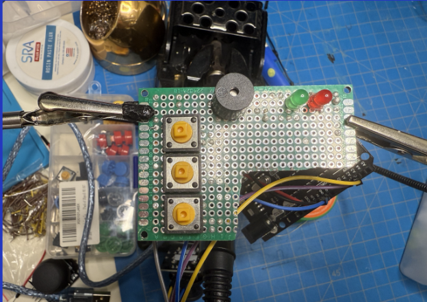
After creating the idea, we started planning and testing connections through a breadboard and code. Once our proof of concept was confirmed, I planned a simulation through Wokwi and prepared to solder everything together.
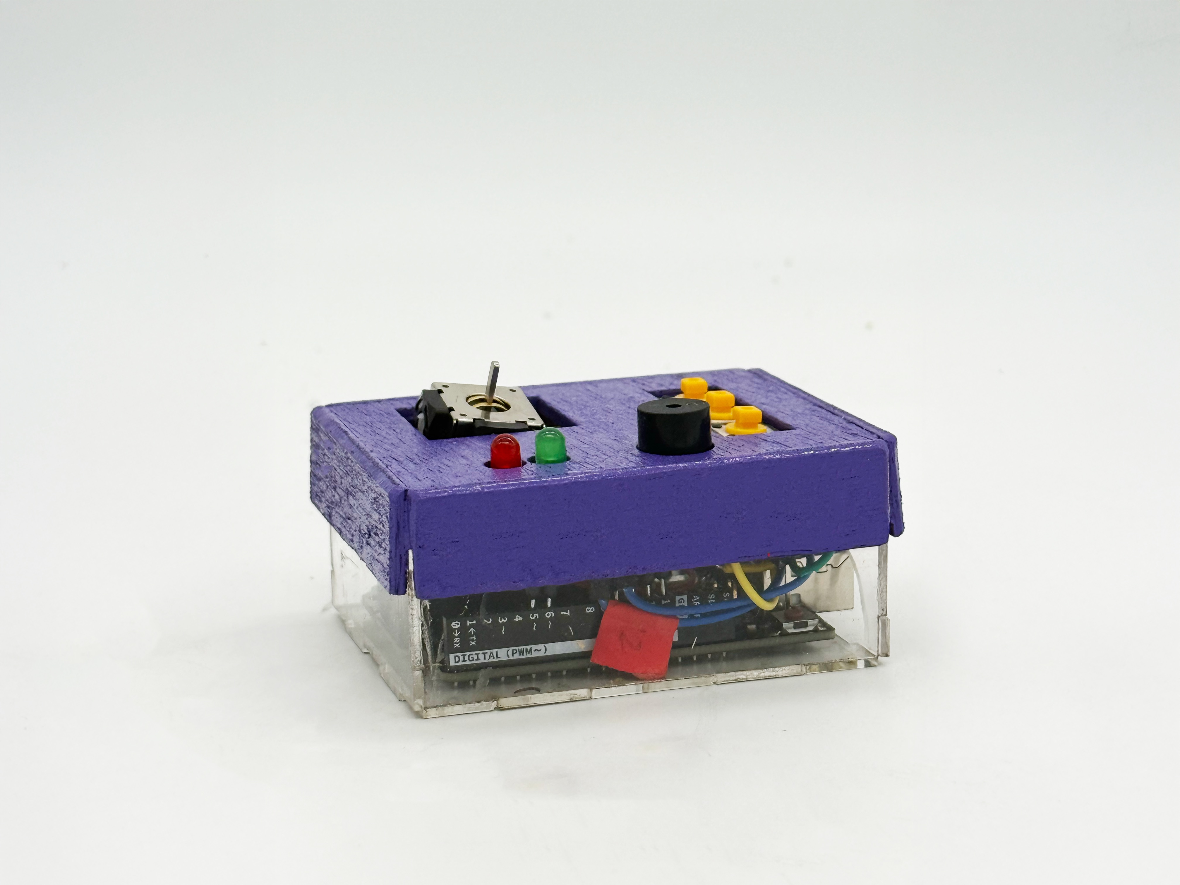
Soldering was a really tedious process-- even if it was only for a couple simple components. My controller only included a joystick, 3 buttons, 1 buzzer and 2 LED lights. Not only was I afraid to waste material if I messed up, but I was also scared to short circuit the arduino.
After completing the soldering on my first PCB board, I discovered the buttons wouldn't respond. I started fresh with an entirely new setup, and was rewarded when everything finally worked perfectly.
After getting everything internally working, I started crafting a case that would be both cost-effective and aligned with my brand design. I searched through discarded materials at my school's creator studio, finding perfect plywood and acrylic slabs that offered ideal thickness without being heavy or flimsy. Though 3D printing was available, I preferred the rewarding experience of building by hand.
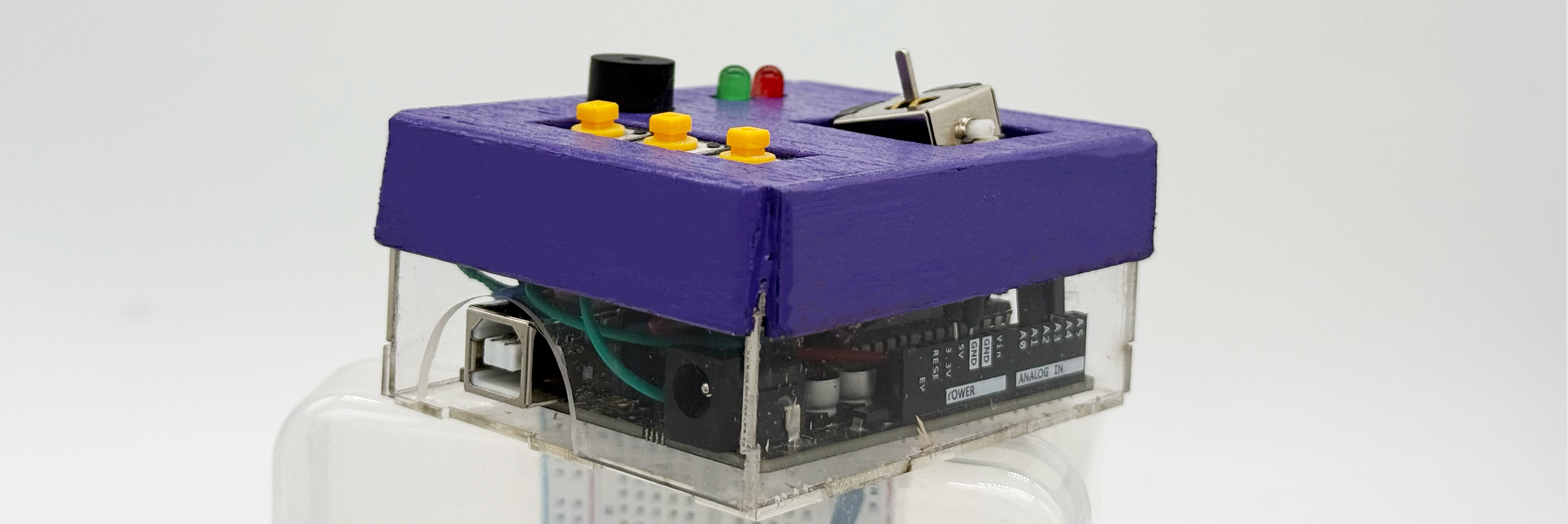
I chose clear acrylic for the bottom of the case to showcase the circuitry, which perfectly complemented our brand, since it was called Circuit Breakers. The visible components transformed what's typically hidden into a key design feature. I wanted to celebrate the technical ingenuity while maintaining an honest design aesthetic where nothing needed to be concealed.
For the top, I chose to use wood, since I only had a day to build and polish up the casing. This was definitely faster as I used wood glue and a laser cutter to piece it together.
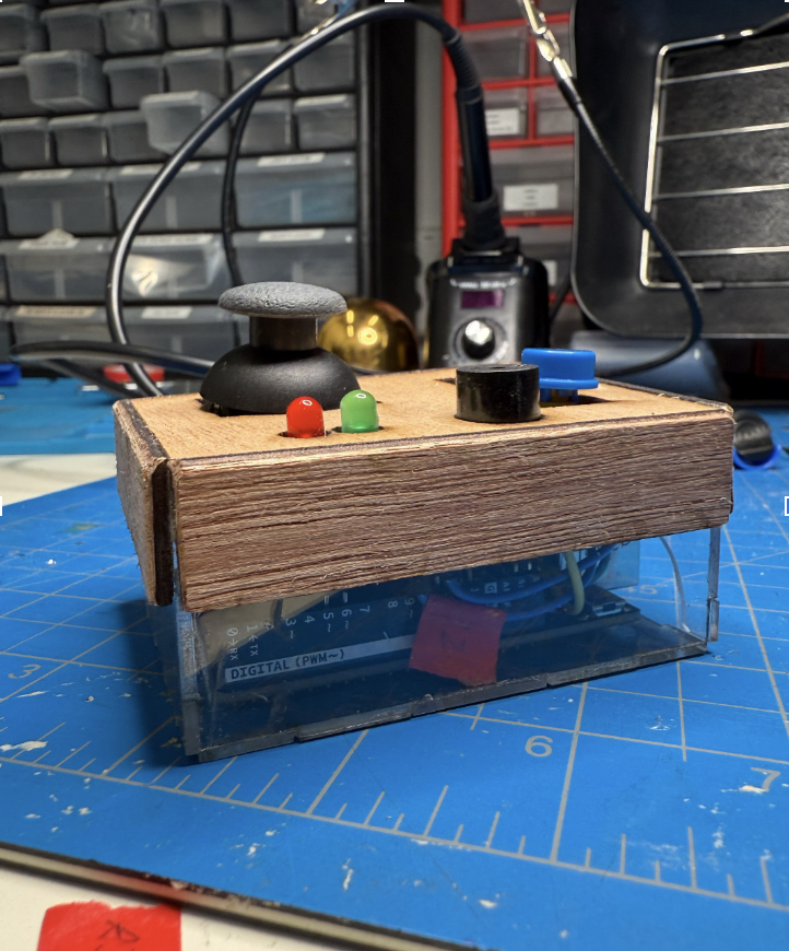
After final assembly, I realized the joystick and button caps looked overly refined against the raw acrylic casing. By intentionally leaving them unfinished, I achieved a more cohesive aesthetic throughout the product. This process taught me that imperfection can sometimes create more authentic, usable designs than polished perfection.
Lastly, I was initially of staining the wood a dark cherry wood color. However I found the exact shade of purple paint that matched our brand guide and spray painted it instead.
.png)